Building crypto exchange form 0→ 1
At TozenX, I led product design for a new cryptocurrency exchange built from the ground up. Beyond designing key surfaces like onboarding, account management, my role was to ensure the entire platform behaved as a coherent product — not a collection of features.
I established the design principles, built a design system, and guided a team of 3 designers while working closely with product and engineering to balance usability, trust, and compliance. This project focused less on crafting individual screens and more on creating structure: helping a fast-moving startup ship quickly without losing clarity or consistency.
Disclaimer: Due to the non-disclosure agreement, I am limited in the amount of work I can show.
Client:
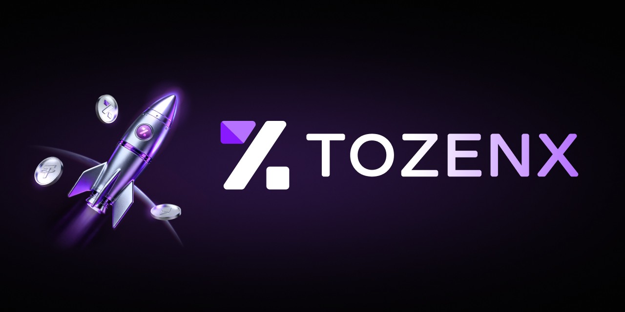
TozenX
Role:
Product Design Head
Year:
2025
Context
TozenX was a newly launched cryptocurrency exchange being built in parallel across multiple teams. Features were moving quickly, but there was no design foundation — every flow behaved differently, and development slowed because decisions were constantly re-discussed.
I was brought in to own product design across the platform. My responsibility was not just delivering screens, but creating structure: aligning designers, product managers, and engineers so the product could scale without becoming fragmented.
My Role
Beyond designing key surfaces, I ensured the platform behaved like one coherent product. I set design principles, reviewed product decisions, mentored designers, and partnered closely with product and engineering to balance usability with compliance requirements — a constant tension in crypto products.
Rather than being the person who designs everything, my goal was enabling the team to design consistently.
The Core Problems
Early users of a new exchange don’t judge features — they judge trust. We faced three main risks:
A new brand with low credibility
KYC compliance creating onboarding friction
Multiple designers producing inconsistent experiences
Without intervention, the product would ship features but feel unreliable.
Leadership Contribution
My role extended beyond delivering designs — I was responsible for how design decisions were made across the product.
I introduced regular design reviews to align designers on reasoning rather than visuals, assigned clear ownership areas so each designer could make independent decisions, and acted as the bridge between product, engineering, and compliance when trade-offs were required. Instead of correcting outputs, I focused on setting direction and principles, allowing the team to move faster without fragmenting the experience.
Over time, designers shifted from executing tickets to participating in product discussions, and product decisions no longer depended on a single person reviewing every screen.
Key Work
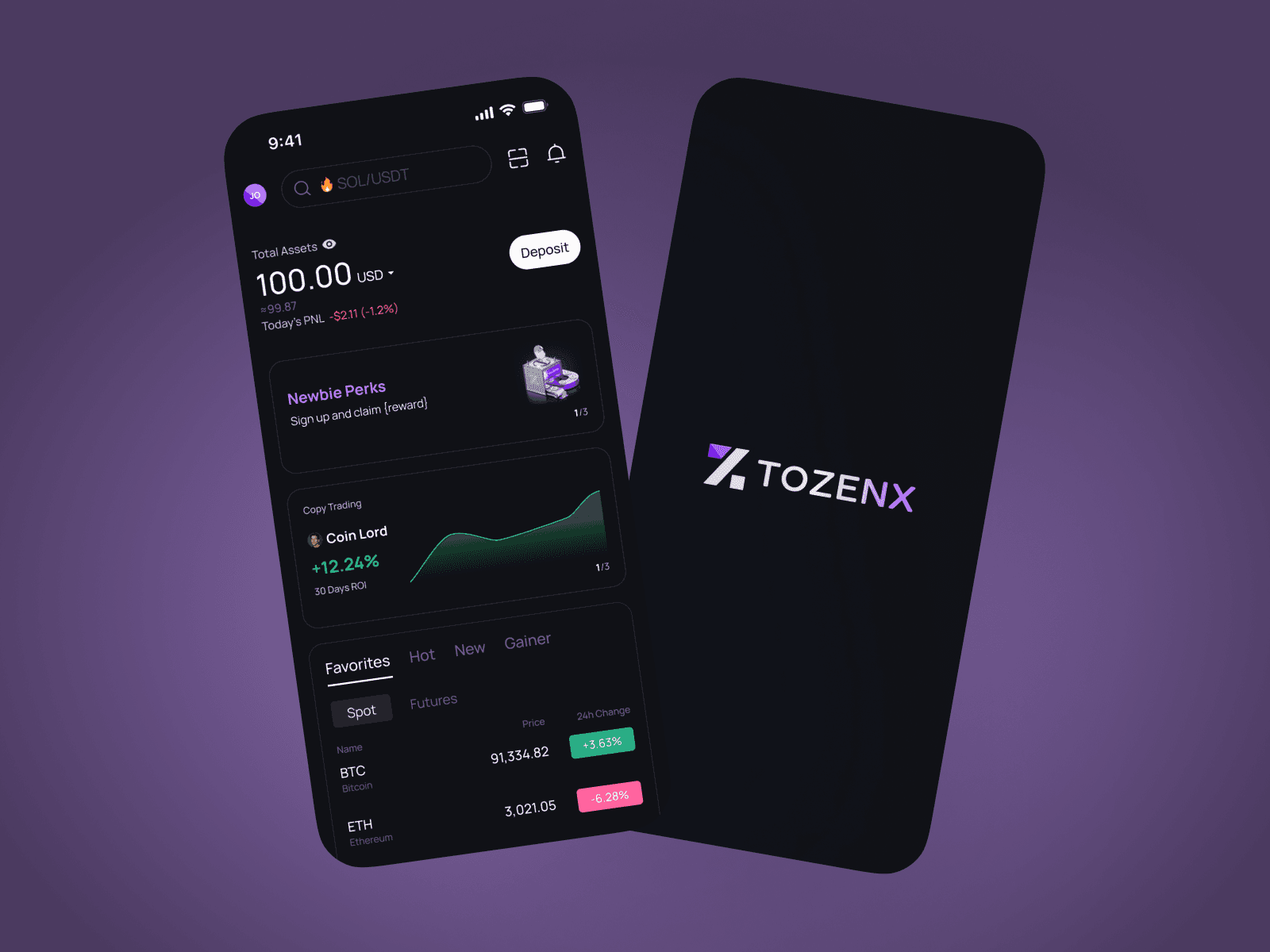
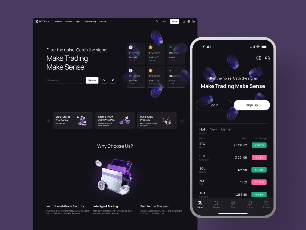
Landing Page — Establishing Trust for a New Brand
As a new exchange with no market credibility, the landing page needed to answer the user’s biggest question: is this safe to use?
I defined what information should appear and in what order — prioritising security transparency, product clarity, and entry actions rather than promotional messaging. I also worked closely with the marketing team to shape the visual identity, aligning layout, typography, and visual language so the brand felt reliable and consistent across channels. The page became both the acquisition entry and the first layer of trust building.
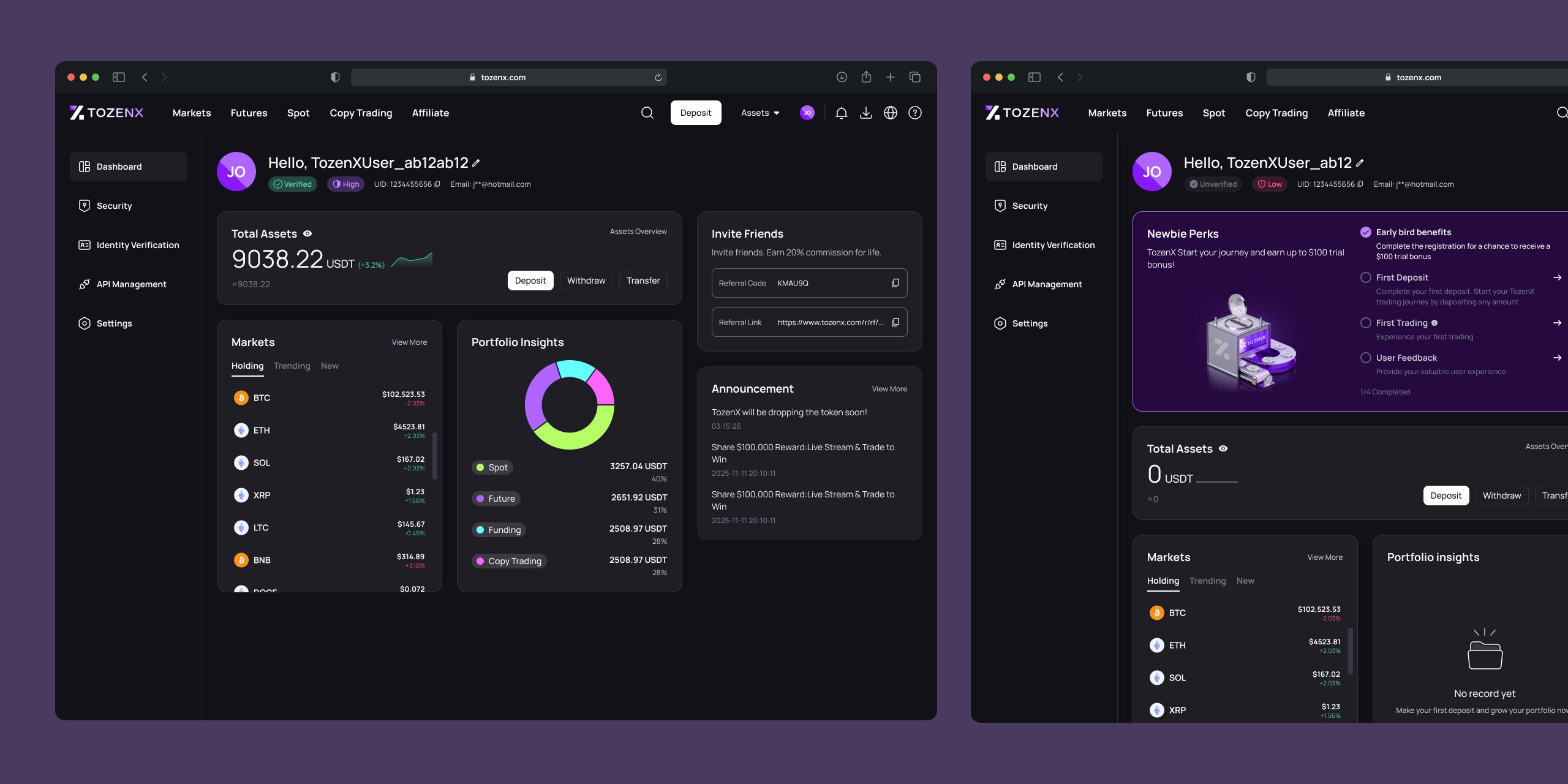
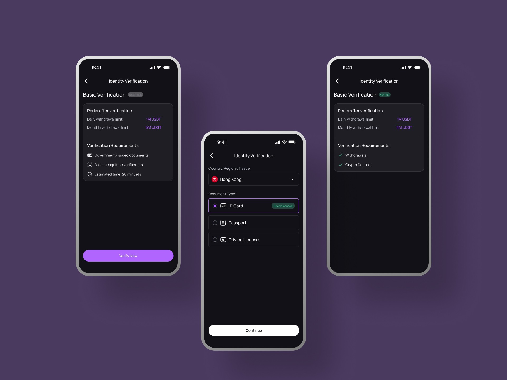
Personal Centre — Structuring the Core Account Experience
The personal centre contained multiple critical areas including dashboard, security settings, API management, and KYC. Instead of treating them as isolated pages, I structured them as a unified control space.
I designed dashboard states tailored to different user situations — new users, users who had not completed setup tasks, and users without trading activity — so the interface always communicated next steps clearly.
For security settings, I refined the flows to increase protection requirements while keeping actions understandable, ensuring users could strengthen account safety without confusion.
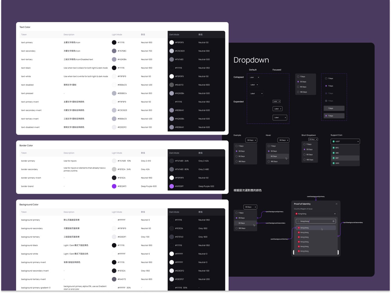
Design Library — Creating a Scalable Product Language
To prevent inconsistency across teams and platforms, I built a shared design library for both web and app. This included tokens, reusable components, interaction patterns, and documentation so designers and engineers could reuse established decisions rather than redesigning features.
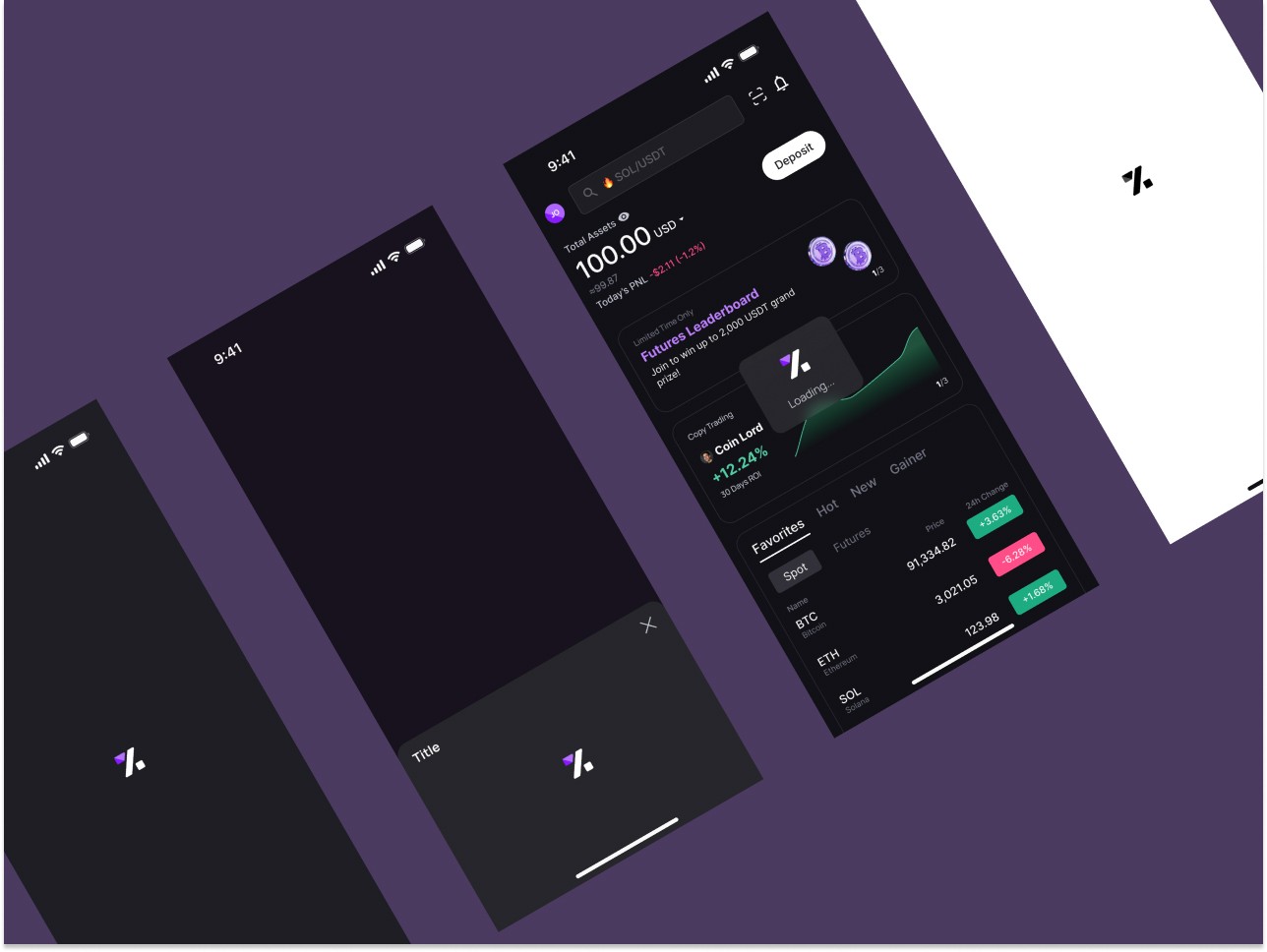
I also introduced motion elements such as logo loading animations and tab bar micro-interactions to reinforce brand identity and make the product feel more polished and cohesive.
Outcome and Reflection
The platform moved from a collection of features into a predictable product experience. Designers worked more autonomously, development cycles shortened, and the product felt trustworthy despite being a new brand.
Building a 0→1 exchange required defining how decisions are made, not just what gets designed. The most valuable contribution was establishing a framework that allowed the team to ship quickly without sacrificing clarity — turning speed into a repeatable process instead of chaos.